For June’s edition of From the Designer’s Desk, Jenny Chan of Jack Design takes us from blank slate to finished product, offering technical explanation and emotional insight along the way.
Jenny Chan—
Recently I noticed that whenever I submit a first round of sample designs, I have the same queasy, anxious feeling I used to get as a student handing in that final paper or exam. There is that nagging urge to hold off submitting for just a few more refinements, to make another little tweak here and there, all in pursuit of an ideal that may, sadly, only live in my mind.
Because once that design is sent off into the world, it is on its way to becoming a reality. You’ve committed to it, and it is no longer just one of many tantalizing possibilities.
My favorite phase
At the start of any project, before pencil hits paper, there’s a wonderful prelude of reading, looking, and talking. Though a book’s trim size, page count, and word and image list may already be predetermined, the slate is thankfully still blank. This is the luxurious moment when the design can be just about anything and everything.
In this phase, I am free to explore the basic questions of what attributes of project should have and what formal choices will help the object express itself clearly to its intended audience.
The type
When pen finally does hit paper, a key starting point is typographic exploration. For display type, that means sketching the key text in a variety of typefaces, and in different weights sizes and combinations. Often, the goal for display type is expressiveness and impact.
For the text type, the goals have an additional layer of practical concerns. For example, how many words need to be on the page? Does the text require unique characters or many weights or styles to create distinction within different kinds of information? Am I looking to achieve a dense, dark text block or something lighter and more airy?
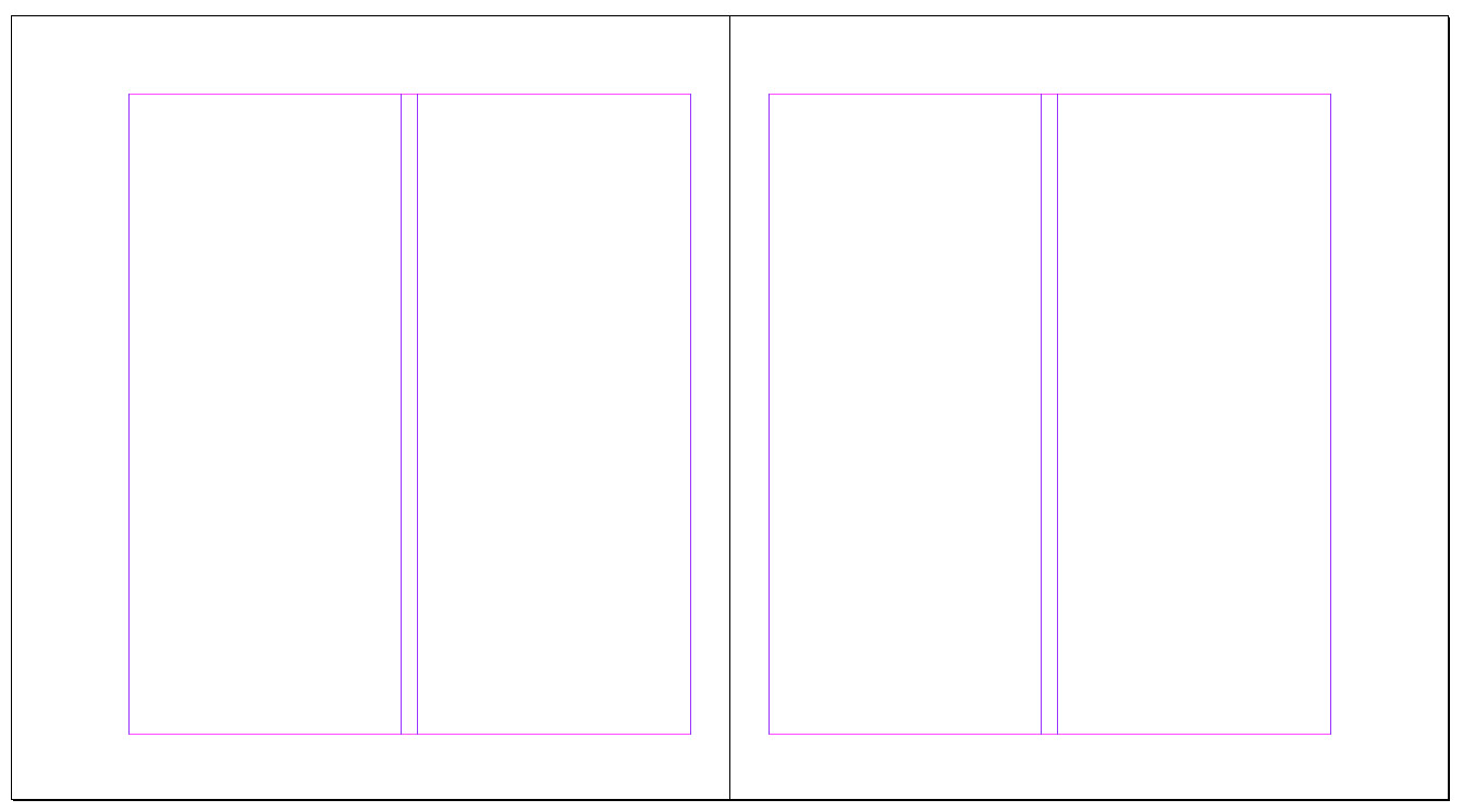
Usually this kind of exploration takes place in conjunction with the development of the page grid. That is because the look, feel, and size of the textblock is directly related to line length, number of characters and words per line, number of columns per page, and the margin widths. It’s a bit like developing a recipe, a balancing of flavors and textures to conjure a single, coherent experience. But once the challenge of creating a useful textblock is achieved, the fun can begin: the folding in of images, captions, running heads and feet, folios, etc. These elements, how they relate to each other and in what sequence, is the foundation for the entire book design.
A freestanding universe
For me, the pleasure of creating a design object or experience lies in the process of developing a visual system and formal vocabulary that is unique and specific to that particular project. As I narrow down the possibilities for formal solutions, it gradually becomes a universe that stands clearly on its own and that communicates its “personality” in a simple voice.
But as the various ideas finally begin to coalesce into a single concept, I do get that feeling of commitment anxiety and fear that there might have been an ingredient that I have overlooked. I have to accept that is the nature of these kinds of endeavors, and fortunately, as projects move along into layout and production, I have been generally pleased with the decisions made early on. And of course, there is always that next project to explore.


 Deobandism, Islam and the Religious Narratives of the Taliban